8 Best Visual Storytelling Techniques and why they matter
Understand the best visual storytelling techniques for books, covers, and creative projects that build emotion, clarity, and memorable worlds. Why hiring a professional illustrator matters. A strong image can do what pages of explanation often cannot. Let´s explore them.
CHILDREN'S BOOK ILLUSTRATOR FOR INDEPENDENT AUTHORSHUMAN ILLUSTRATORCHILDREN´S BOOK ARTISTCHILDREN'S BOOK ILLUSTRATION SERVICESCHILDREN'S BOOK ILLUSTRATION STYLESELF PUBLISHINGCREATIVE RESOURCES FOR INDEPENDENT AUTHORSHOW TO GET A CHILDREN'S BOOK ILLUSTRATEDCHILDREN'S BOOK ILLUSTRATION PORTFOLIOFREELANCE CHILDREN´S BOOK ARTISTHOW TO FIND A CHILDREN'S BOOK ILLUSTRATORBEST VISUAL STORYTELLING TECHNIQUES
By Alcaminhante
6/3/20269 min read
A strong image can do what pages of explanation often cannot - establish mood, reveal character, and make a reader feel the story before they fully understand it. That is why the best visual storytelling techniques matter so much for authors, publishers, and creative teams. In children’s books, fantasy art, book covers, comics, and concept-driven publishing, the artwork is not decoration. It is part of the storytelling engine.
Illustrators usually feel this instinctively. We know when an illustration feels flat, even if the draft is strong. We know when a cover is technically polished but says nothing about the world inside. Visual storytelling is the difference between a competent image and one that carries narrative weight.
Part of being an illustrator is to deal with the frustration of not getting something right when I know I did everything as I should, but somehow a pic still does not work.
Well, the trick is to stick with it and keep trying until it does.

What makes the best visual storytelling techniques work?
The strongest narrative art does three jobs at once. It communicates information, creates emotion, and invites curiosity. If one of those is missing, the image may still look attractive, but it will not hold attention for long. This is why it´s important for an indie author who wants to self-publish a book to pick a real professional illustrator and not just go with the first cheap option found on Fiverr, for example, where quality and professionalism are like a gamble.
This is where many creative projects run into trouble. A piece can be beautifully rendered and still fail because the focal point is unclear, the character acting is generic, or the setting does not support the story. Technique alone is never enough. The image needs purpose.
If at ICreateWorlds I´m working for an established mainstream publisher, for example, they already know this, but for authors and indie publishers, this is especially important to understand before hiring a freelance artist or illustrator, because every illustration has to earn its place. In a picture book, each spread needs to advance the emotional arc. In a cover, the composition has to promise a reading experience in seconds. In concept art, the world must feel lived in rather than invented on the spot.
1. Building the image around a clear story moment.
One of the best visual storytelling techniques is choosing the right moment to depict. Not every scene deserves an illustration, and not every dramatic event makes a good image. Sometimes the most powerful visual moment happens just before or just after the action.
A child hesitating at the edge of a dark forest can say more than the scene where she runs into it. A wizard studying a cracked map may create more tension than the battle itself. Good storytelling art often lives in anticipation, reaction, and consequence.
This matters because viewers read images fast. If the chosen moment is muddy, the story becomes muddy too. The best illustrations are built on a single readable idea: discovery, danger, wonder, loss, reunion, mischief. If you can name the emotional event in a few words, the image usually has a stronger foundation.
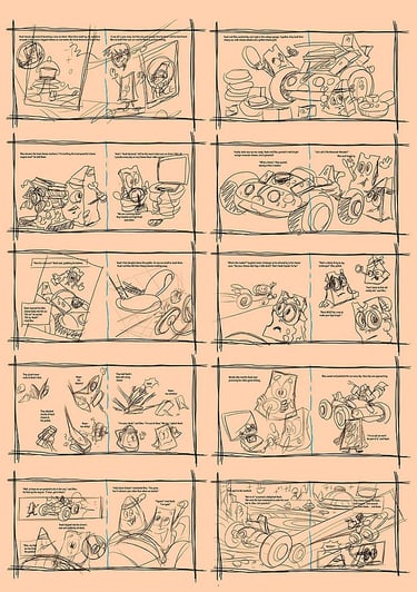
This is why at ICreateWorlds, when I get a new children´s book to illustrate, the most important phase for me is the storyboard one. Not because I´m sketching the scene, but because it´s there when I establish every visual composition, choose "where to place the camera" to "shoot" the moment and establish the visual structure and narrative flow.
Independent self-published authors tend to think that illustrating a book is just painting pretty pictures, but few newbie authors even consider how a picture should be planned. That is why we see many indie self-publishing authors fail with books filled with pretty pics but that overall feel unbalanced and stale.

2. Using composition to control the reader’s eye.
And with point 1, I meant to explain that composition is not just design. It is a direction. It tells the viewer where to look first, what to notice second, and what emotional relationship exists between the elements in the scene. And that takes years of practise for an illustrator to learn, and this is one key reason why you should invest in hiring a real professional, instead of going with a cheap solution.
In an illustration, a low angle can give a character a sense of power. A wide composition can create loneliness. Tight framing can make a scene intimate or uncomfortable. Diagonal shapes add movement, while stable horizontal structures can calm the image. These choices are not cosmetic. They shape meaning.
For book covers and interior illustrations alike, clarity is crucial. If the viewer’s eye wanders without landing on the narrative centre, the image loses force. This is one reason crowded concept art often underperforms in publishing. It may contain impressive detail, but if nothing is prioritised, the story gets buried.
There is a trade-off here. Rich, complex compositions can reward long looking, especially in fantasy and sci-fi worlds. But complexity only works when the hierarchy is clear. The eye still needs a path.

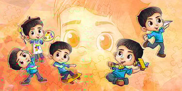
3. Allowing for character acting to carry emotion.
Readers connect to people, creatures, and personalities before they connect to visual polish. Character acting is one of the best visual storytelling techniques because it turns illustration into performance.
A hand pulling back, a tilted posture, a stubborn chin, a forced smile - these small signals do enormous narrative work. In children’s illustrations especially, body language often needs to do more than facial expressions alone. Young readers read attitude quickly, and memorable characters are built from readable silhouettes and expressive poses.
This is also where many commissions either come alive or fall flat. If a character looks generic from scene to scene, the world around them cannot compensate. Strong acting provides continuity throughout the project. It tells the reader that this is who this character is under pressure, in joy, in fear, in wonder. For authors, this means reference and briefing matter. Saying a character is brave or shy is less useful than describing how they occupy space. Do they lean forward into trouble? Hide behind objects? Move as they belong in the world, or like they are trying not to disturb it?

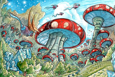
4. Designing the environment as part of the narrative.
Backgrounds are often treated as support material. Many independent authors don´t even think about them when writing a story. But, in good visual storytelling, they are active participants, and in my particular case as an illustrator, environments are where I start each scene. If I get to visually establish the world each scene is set in, having the characters in there is way easier than if I just start by illustrating them.
A room can reveal habits, class, era, and emotional state. A forest can feel enchanted, ancient, playful, or threatening based on shape language, lighting, and scale. A science-fiction corridor can convey optimism, decay, control, or danger before a single character appears.
This is where experienced worldbuilding makes a visible difference. The setting should not feel like wallpaper pasted behind the figure. It should feel connected to the story’s logic. In professional illustration, that usually means asking practical questions. Who lives here? What has happened here? What materials exist in this world? What mood should the viewer absorb before reading any text?
For publishing clients, this matters both commercially and artistically. No matter if I´m working for an established publisher or if I´m working for a self-published author who is just starting, creating distinct environments helps a project feel authored rather than assembled from visual clichés.
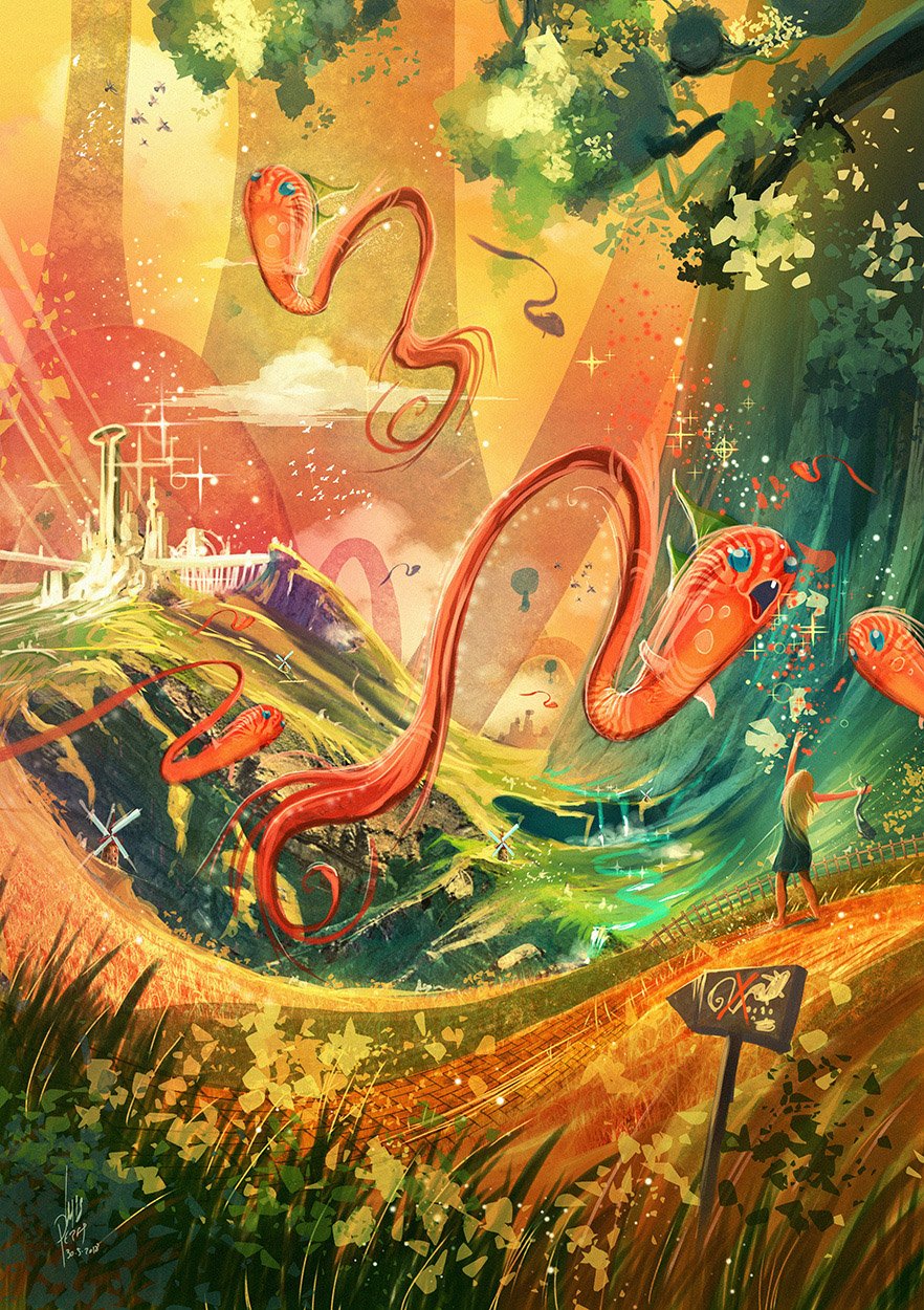

5. Using colour and light with narrative intent.
Colour is one of the fastest emotional signals in an image. Light is one of the fastest structural ones. Together, they can define tone before the viewer has processed the subject matter.
Warm light can suggest safety, nostalgia, or magic. Cool light can feel lonely, mysterious, or restrained. High contrast often creates tension and drama. Softer value patterns can feel lyrical or dreamlike. None of these effects is automatic, but they are powerful when used deliberately.
The mistake is using an attractive colour without story logic. A beautiful palette that contradicts the narrative weakens the image. If the scene is meant to carry dread, overly cheerful lighting may confuse the emotional read unless that contrast is intentional.
This is especially relevant for book covers. Readers often decide whether a book feels right for them before consciously processing genre details. Colour and lighting are part of that instant promise.
6. Simplifying to strengthen the message.
Detail is seductive, especially in fantasy illustration and concept painting. Trust me, I know it as I tend to go overboard with my details when it comes to concept art and sci-fi illustration, as I love to add stuff that people won´t even notice is there.
But one of the best visual storytelling techniques is knowing what to leave out.
Too much texture, too many props, and too many equal points of interest can dilute the story. The eye has limited patience. If every corner of the image shouts, nothing is heard clearly.
Simplification does not mean making the work plain. It means choosing what deserves emphasis. In children’s books, this often improves readability and emotional clarity. In covers, it can improve market performance because the main idea remains visible even at thumbnail size. In concept art, it helps decision-makers quickly understand the world.
The right level of detail depends on the format. A full spread can carry more complexity than a spot illustration. A collector’s edition cover can support richer ornament than an online sales thumbnail. It depends on where and how the image will be seen.


7. Creating visual contrast in every scene.
Stories move through contrast, and images should too. Large against small. Soft against sharp. Light against dark. Stillness against motion. Familiar against strange. Without contrast, scenes can become visually monotone even when the drawing is skilled. Contrast creates emphasis and tension. It also helps define what is unusual in the world.
A tiny child in a vast mechanical city immediately suggests vulnerability and scale. A bright red scarf in a muted winter setting becomes a narrative anchor. A cheerful creature in a ruined landscape raises questions the viewer wants answered.
This is one reason visual storytelling often feels stronger when concept and execution are developed together. Contrast is not an afterthought. It should be built into the idea from the beginning.
8. Think in sequences, not isolated images.
One image can tell a story, but most publishing projects ask for more than one. That means continuity matters. The best visual storytelling techniques are not only about making a single illustration work. They are about making a series feel coherent.
Character proportions, costume details, lighting logic, emotional progression, and environmental consistency all shape the reader’s trust. If the visual language shifts without purpose, the narrative loses stability. In picture books and illustrated stories, pacing across pages matters as much as the strength of each individual piece.
This is where a seasoned illustrator becomes a production partner, not just an image-maker. The work is not merely about rendering scenes. It is about building a visual rhythm that supports the manuscript, cover strategy, and reader experience from start to finish. That approach has always mattered in professional studio practice, and it is one reason long-form storytelling projects benefit from an artist who understands both atmosphere and continuity.
In the indie scene, the biggest mistake an independent first-time self-publishing author can make is hiring a professional illustrator more as a remote-controlled pencil than trusting that the person has the professional experience to actually take a book to the next level. The "it´s my vision, and you will do what I want" attitude is usually the main reason an indie project fails even before the book is on print.
The real goal is to make every image clearer, more intentional, and more alive to the needs of the story. When artwork does that, readers feel invited into a world rather than merely shown a picture. That is the kind of visual storytelling people remember long after they close the book.