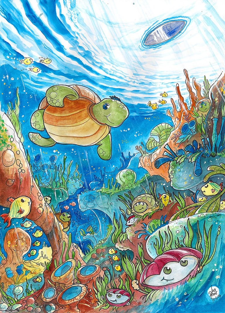
Children's Book Illustration Portfolio Tips
Build a children's book illustration portfolio that shows style, storytelling, range, and market readiness for authors and publishers alike. In children’s publishing, artwork carries narrative weight. Learn how to set up your portfolio with these Portfolio Tips.
CHILDREN'S BOOK ILLUSTRATOR FOR INDEPENDENT AUTHORSCHILDREN´S BOOK ARTISTCHILDREN'S BOOK ILLUSTRATION SERVICESCHILDREN'S BOOK ILLUSTRATION PORTFOLIOFREELANCE CHILDREN´S BOOK ARTIST
By Alcaminhante
5/30/20268 min read
A weak sample can lose a book before the first email gets a reply. A strong children's book illustration portfolio does the opposite - it helps authors and publishers instantly picture their story in their hands.
That is the real job of a portfolio. Not to show everything you have ever drawn, and not to prove you can mimic ten different trends. It should show that you understand visual storytelling, character appeal, page-to-page consistency, and the commercial demands of children’s publishing. If a client is trusting you with a manuscript, they need more than pretty pictures. They need evidence.
What a children's book illustration portfolio is really selling.
In children’s publishing, artwork carries narrative weight. It introduces character, mood, pacing, humour, tension, and emotional warmth before a child can fully decode the text. Because of that, your portfolio is not simply an art gallery. It is a promise about how you handle the story.
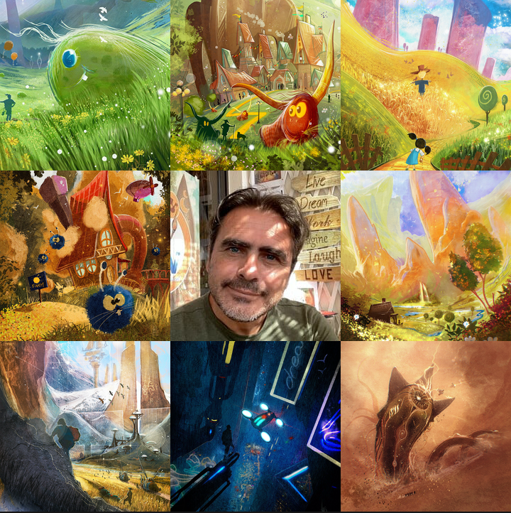
In my experience at ICreateWorlds.net, experienced authors (indie or mainstream writers) and art directors are usually looking for three things at once. First, they want a visual style that feels inviting and memorable. Second, they want reliability - can this illustrator sustain quality across a full book, not just one polished hero image? Third, they want to fit. A gentle bedtime story, an educational picture book, and a wild fantasy adventure do not ask for the same visual energy. Or the same illustration technique is one size fits all, but many times the way we create an image needs to change depending on the objective.
Even when I illustrate sci-fi or fantasy, the techniques I use end up being totally different from what I do to illustrate a children´s book. There are a lot of ways to create an illustration, and most people don´t realise that. Drawing, painting, concept art techniques (photobashing), etc.
That is why the best portfolios feel curated rather than crowded. They are built around trust. Each piece should answer a practical client question: Can this artist design expressive characters? Can they stage a scene clearly? Can they paint backgrounds without losing the focal point? Can they make a page feel emotionally alive?
What to include in a children's book illustration portfolio.
A portfolio for this field should show more than isolated spot illustrations. Single images have value, but children’s books live in sequence. If your presentation only shows finished one-offs, clients may still wonder whether you can carry a visual narrative from page 1 to page 32.
Start with your strongest work, but make sure it reflects the kind of commissions you want. If you want picture book projects, show picture book work or portfolio pieces that clearly look publication-ready. A beautifully rendered sci-fi landscape may be impressive, yet it will not help much if your ideal client writes early-reader animal stories.
Include character-focused artwork that reveals personality at a glance. Children’s books depend on readability and charm. Expressions matter. Silhouettes matter. Costume choices, shape language, and body language all matter. A client should be able to understand who the character is before reading any text.
Then show scenes with interaction and storytelling. A child reaching toward something forbidden, siblings arguing over a toy dragon, a nervous rabbit entering a moonlit forest - these moments demonstrate your grasp of narrative tension. They prove that your images are not decorative. They move a story forward.
It also helps to include a few examples of environmental storytelling. Backgrounds in children’s books are not filler. They build the world, establish tone, and create opportunities for discovery. Whether your style is whimsical, classic, graphic, or richly painted, your settings should support the action rather than compete with it.
If you have published work, include it. Finished covers, spreads, and printed books show real-world experience and commercial credibility. If you do not yet have client projects, create portfolio samples that look like actual book assignments. Spec work is perfectly valid when it is intentional and polished.
The difference between attractive art and book-ready art.
This is where many portfolios go off track. An illustrator may have genuine talent, but the work still does not feel ready for children’s publishing because it lacks practical storytelling discipline.
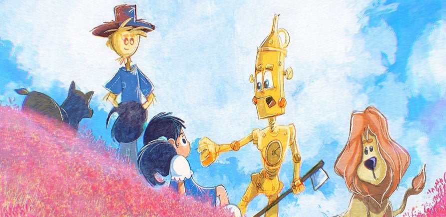
Book-ready art usually shows consistency. Characters do not drift off-model from one image to the next. Lighting choices support the mood. Compositions lead the eye clearly. There is room for text where needed. The age level feels defined. A toddler board book, a picture book for ages 4 to 8, and a middle-grade illustrated chapter book all require different visual decisions, and in my own experience at ICreateWorlds.net, they often require entirely different illustration techniques, tailored to the characteristics of each project.
So, a good idea to include in your portfolio is that you can adapt to any type of project a client commissions.
There is also a balance to strike between style and usability. Highly experimental work can stand out, but if every image demands interpretation, some clients will hesitate. On the other hand, work that feels generic may appear safe but forgettable. The strongest portfolio pieces tend to sit in that sweet spot where the art has both personality and market awareness.
How much range should your portfolio show?
Range helps, but only when it is controlled. This is one of the biggest trade-offs in building a children's book illustration portfolio.
If you show too little variation, clients may worry that every project will look the same. If you show too much, your body of work can feel fragmented, as if several different illustrators are competing on one page. That makes it harder for a publisher or indie author to understand what they would actually get from hiring you.
A better approach is to show range inside a recognisable artistic identity. Maybe your linework, colour sense, or character construction ties everything together even when the projects vary in subject matter. You can present playful animal casts, fantasy scenes, educational content, and emotional family moments, but the portfolio should still feel authored.
This matters especially for storytellers who need visual worldbuilding, not just one commission. A seasoned studio or illustrator can show breadth without losing cohesion. That kind of portfolio reassures clients that imagination is backed by process.
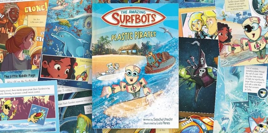
A strong children's book illustration portfolio shows process, too.
Finished art wins attention, but process builds confidence. Many authors, especially first-time self-publishers, do not just want to know whether you paint beautifully. They want to know whether you can guide a manuscript through the development process.
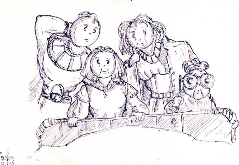
A few carefully chosen process pieces can help. Sketches, character turnarounds, expression sheets, page roughs, and progression from concept to final art reveal how you think. They also signal that revisions and storytelling decisions are part of your workflow, not obstacles to it.
I´m actually guilty of not exactly following this "rule" myself. I´m not an illustrator who does many preparatory sketches because my artwork is very organic and at first glance "unplanned". I like to create a basic rough sketch more for myself than to show the client, as I need it to plan my "camera placement" and not exactly to let the client know what the final piece will look like. So I don´t have many sketches to showcase on my own portfolio simply because my creative process is very loose and organic, and many times I only know how a pic will look at the end when I complete it. If I planned all my artwork rigorously, I would lose energy, and the final pic would look sterile and lifeless.
Nevertheless, I still agree with the traditional idea of showcasing some sketches in your portfolio. Although I´m guilty for not exactly following that myself.
This does not mean flooding your portfolio with rough drafts. Keep the spotlight on polished work. But adding select behind-the-scenes material can make your presentation feel far more professional, especially for clients comparing illustrators with similar technical skills.
Common mistakes that weaken a portfolio:
The first is showing too much mediocre work alongside strong work. Clients rarely separate the best from the weakest. They average everything together. One dated piece can make the whole portfolio feel less reliable. In my website I take a big risk with this myself, as I also like to showcase some drawings from when I was a kid or a teenager before I became a pro illustrator in 1992. But many people over the years were curious to see how my early artwork was like and so I decided to also showcase some of my kid art along with my current pro portfolio. I do not recommend you do the same as for some people that may be artistic suicide. But I´ve been a professional illustrator since 1992, so at this point, I´m experienced enough to take stupid risks like this on my own portfolio.
The second is leading with work that does not match your target market. If your homepage opens with dark concept art or unrelated commissions, a children’s author may never scroll far enough to find the relevant samples. I struggle with this a lot myself. My portfolio is filled with unique single illustrations and also concept art for different projects than children´s books but I have a whole section for children´s book in the site. But this is the problem of having a portfolio since 1992. At this point I don´t even think too much about what I post, which is a behavior you should not emulate. If you are just beginning, I advise you to put more thought into this than I do on my ICreateWorlds.net site.
The third is relying on style alone. Children’s publishing is full of beautiful art, but beauty without clarity is not enough. If the viewer cannot read the emotion, action, or audience level quickly, the work may fail the commercial test.
Another frequent issue is inconsistency in presentation. Cropped images, mixed resolutions, or a confusing gallery order can make excellent art feel less professional. Your portfolio should feel edited with the same care you would bring to a finished book.
Building a portfolio that attracts the right clients.
The goal is not maximum attention from everyone. It is the right attention from people who need what you do best.
If you want to work with indie authors, show that you understand full-book storytelling, cover appeal, and emotional accessibility. If you want publishing houses, emphasize consistency, age-appropriate style, and the ability to work within editorial needs. If your strength is imaginative worldbuilding, let that come through in ways that still support child-friendly storytelling.
This is where experience becomes visible. A mature portfolio does not simply say, "I can draw." It says, "I know how to turn words into a visual world readers want to enter." That difference matters. It is also why a portfolio-driven brand like ICreateWorlds can speak to both dream and delivery at the same time.
A children's book illustration portfolio should leave a client with a clear feeling: this artist understands story, understands readers, and can carry a project from first sketch to finished pages. If your work creates that confidence, you are no longer just displaying art. You are opening the door to the next book someone has been waiting to make.