Traditional illustration vs digital painting for storytelling
Traditional Illustration vs digital painting: learn the real strengths, limits, and best uses of each for books, covers, and visual storytelling. It carries the physical memory of materials. Watercolour blooms, ink textures, pencil grain, and brush edges create a special connection to readers.
CHILDREN'S BOOK ILLUSTRATOR FOR INDEPENDENT AUTHORSSELF PUBLISHINGCHILDREN'S BOOK ILLUSTRATION PORTFOLIOFREELANCE CHILDREN´S BOOK ARTISTDIGITAL ART VERSUS TRADITIONAL ILLUSTRATION
By Alcaminhante
5/31/20265 min read
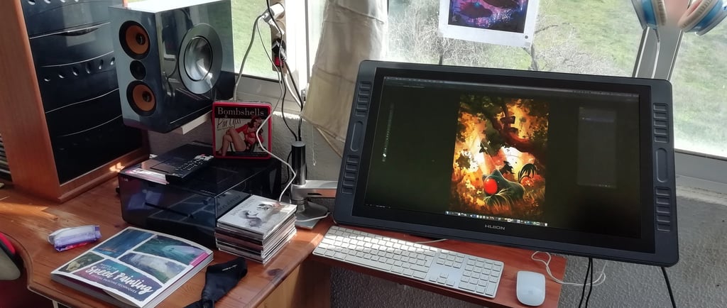
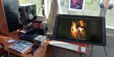
Traditional illustration vs digital painting for storytelling.
When my clients ask about traditional illustration vs digital painting, they are probably not aware of it, but they are rarely asking a purely technical question. In reality, it´s all about what medium will best serve the story, the audience, the production schedule, and the final product. For authors, publishers, and creative teams, that choice can affect everything from emotional tone to print consistency.
This is why the conversation still matters in this digital-illustration age. A charming children’s book spread, a cinematic fantasy cover, and a concept painting for a game world may all call for different visual solutions. The medium is part of the storytelling language.
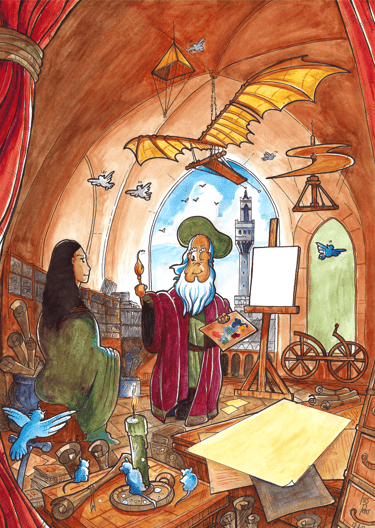
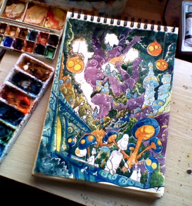
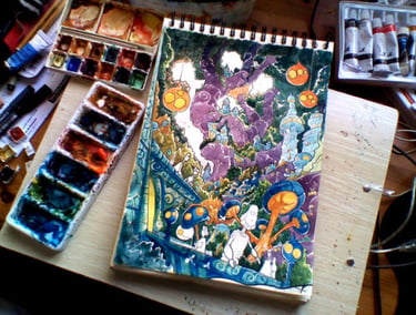
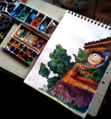
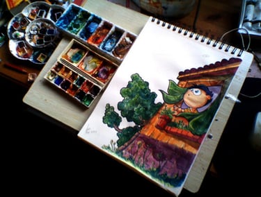
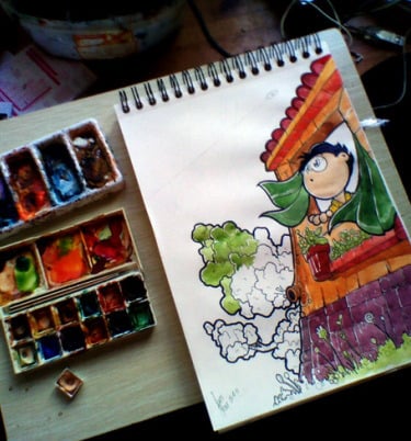
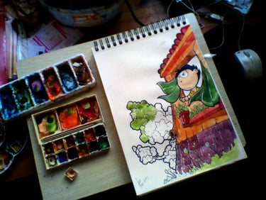
Traditional illustration carries the physical memory of materials. Watercolour blooms, ink textures, pencil grain, and brush edges create a tactile presence that many readers respond to immediately. In children’s publishing especially, that handmade quality can feel warm, intimate, and timeless.
That does not mean traditional work is automatically better for emotional storytelling. It means it communicates differently. A traditional piece often brings happy accidents, surface variation, and subtle imperfections that make the image feel human. For stories that need softness, nostalgia, or a handcrafted identity, this can be a major strength.
Digital painting, on the other hand, offers remarkable control. Light can be adjusted precisely. Colour palettes can be refined across an entire book. Characters can stay on-model from page to page. If a publisher needs alternate cover versions, marketing crops, or print-ready revisions, digital workflows make that process far more practical.
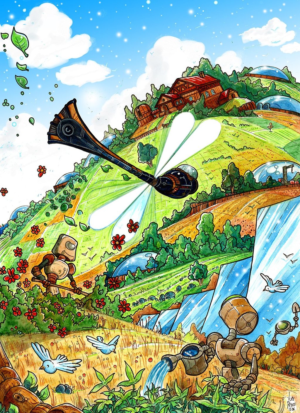
I started transitioning into digital around 2005. Before that year, since I started in 1992, most of my work was purely traditional. Even though for my early work on the video game "GAMBYS" I had already animated and illustrated characters pixel-by-pixel using the old DOS, DELUXE PAINT, way before Windows even existed as a thing, the rest of my illustration work between 1992 and at least 2002 was pretty much in real watercolour, colour pencils and china ink. Around 2005, I started mixing a bit of digital into my traditional illustrations, but most of it was sky replacement and cloud gradients. As depicted in my "Robot Garden" illustration, commissioned by a South African Sci-Fi magazine at the time, the whole drawing was rendered in traditional Chinese ink, and the colouring was done in watercolour and coloured pencils. I didn´t like the original watercolour sky I did, and so I ended up using digital to make it simpler, as it is in the final image. Really basic digital skills yet, but it did the job.
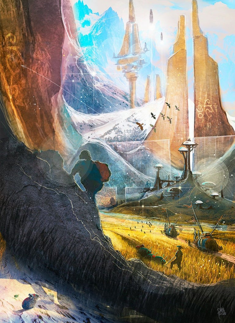
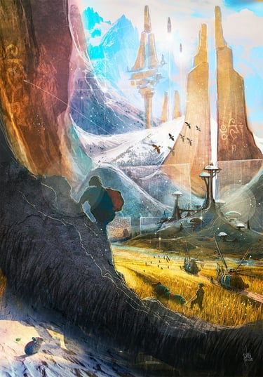
Digital is actually better for one thing, in my opinion. Concept art and concept paintings.
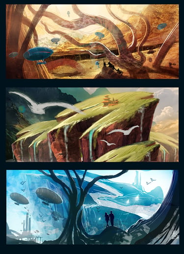
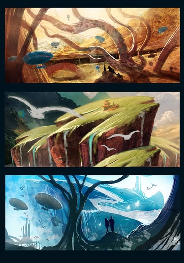
For fantasy, sci-fi, and concept-driven projects, digital painting also supports scale. Complex environments, dramatic lighting, visual effects, and layered compositions are often easier to develop and revise digitally. That flexibility is valuable when a world is still being designed while the art is in production.
Where traditional illustration shines.
Traditional media often excels when the artwork itself should feel like an object with character. Picture books, editorial pieces with personality, collector prints, and certain literary covers benefit from that authentic surface quality. Even before a viewer interprets the subject, they react to the image's material voice. There is also a psychological effect. Readers often associate watercolour, gouache, ink, or colored pencil with care, craftsmanship, and classic storytelling. That can support a book’s positioning, especially when the goal is to create emotional warmth rather than spectacle.
The trade-off is production flexibility. Revisions can be slower and more expensive. Colour correction may be limited once a piece is finished. Scanning and reproduction introduce another layer of quality control. If the project requires frequent client feedback rounds, multiple deliverables, or strict consistency over a long series, traditional methods require more planning from the start.
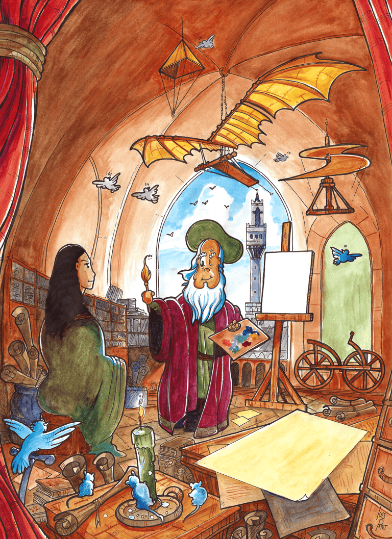
Why digital painting dominates many commercial projects.
Digital painting became standard in many publishing and entertainment workflows for good reason. It allows artists to work efficiently without sacrificing sophistication. A polished digital image can be painterly, atmospheric, and richly textured while still being easy to edit for print specs, formatting changes, or art direction notes.
For book covers, this matters a lot. A title may move. A spine may change width. A sales team may request a stronger focal point. In those situations, digital painting gives both the artist and the client room to improve the image without having to rebuild everything from scratch.
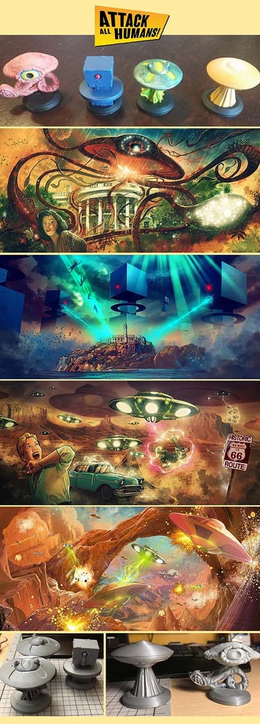
It also supports continuity across product ecosystems. A single illustrated world may need a cover, interior spots, promotional banners, character sheets, and social media assets. Digital files can be adapted more smoothly across those formats, which is one reason many commercial storytellers favour them.
The real question: what does your project need?
A first-time author sometimes chooses a medium based on personal taste alone. That is understandable, but not always strategic. The better question is how the artwork must function.
If your project needs a cosy, classic, handmade feel, traditional illustration may be the right artistic foundation. If it needs fast revisions, scalable worldbuilding, or a full production pipeline for publishing and marketing, digital painting may be the stronger choice.
In practice, many professional illustrators blend both approaches. A piece may begin as pencil on paper, then move into a digital process for colour, cleanup, and final delivery. Or a digital painting may deliberately emulate traditional textures to capture warmth without losing flexibility. For many clients, this hybrid path delivers the best of both worlds.
Choosing the right medium for books, covers, and concept art.
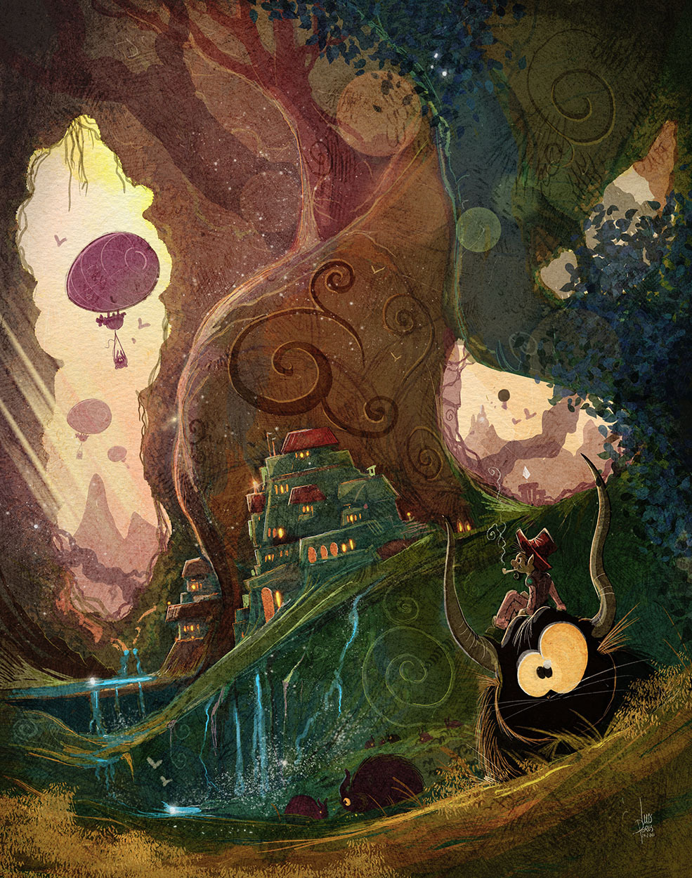
For children’s books, the answer depends on tone and production needs. Gentle stories often benefit from the charm of traditional marks, while series publishing usually benefits from digital consistency. For fantasy and sci-fi covers, digital painting is often ideal because it handles lighting, effects, and revision cycles so well. For concept paintings and visual development, digital is usually the practical winner because ideas evolve quickly.
That said, no medium can rescue weak storytelling. Strong illustration comes f from design, draftsmanship, composition, and narrative clarity. Tools matter, but vision matters more.
An experienced illustrator does not simply pick a favourite medium and apply it to every commission. The smarter approach is to match the medium to the purpose, audience, and deliverable. That is especially true in publishing, where the artwork must not only look beautiful but also support discoverability, mood, and market readiness.
At ICreateWorlds, that decision is part of the larger craft of visual storytelling. The best medium is the one that helps your world feel believable, your characters feel alive, and your finished project feel ready for readers.